It’s no surprise that this infamous L.A. coffee roaster has continued to grow since their humble beginnings. We’re excited to share our latest addition to the Canyon Coffee family — their new single origin bags alongside their recently opened Echo Park café.
Canyons new 12oz bags ensure scalability without the headache of labelling associated with their original kraft bag. The wider natural color palette is drawn from desert plants, stone & sand — befitting for a bag that’s been engineered with sustainability in mind, through the use of compostable materials that meet rigid international standards.
The hierarchical typographic layout clearly delineates brand from single origin varietals, purpose, process and taste profiles. The seasonal bag addresses the same varietal information via a camouflaged front label to adhere to the rest of the family.
The now iconic rose gold foil elevates the pack as it snakes its way around the entire bag to subtlety suggest… this coffee is all about the journey. Enjoy!
With a growing global presence, BODHA needed a compelling document that would serve as their initial introduction to foreign retailers & sales agencies. When you’re relying on imagery & text to convey your brand message in situations with little or no control — these become the bastion to your success.
As a meditative fragrance brand, it was critical the images convey a sense of calm. We travelled to a unique location on the Pacific coast of Oaxaca, Mexico that would help bring this ideology to life. We created a library of bespoke brand & product images that could be used for brand collateral & social media, the imagery builds on BODHA’s brand principles & visual esthetic, reinforcing their position as a leading therapeutic perfumery brand.
‘Vibrations are the language of all living things. They are the unseen forces shaping the texture and tone of our days. Our Vibrations Collection nurtures & expands your energy through the power of nature in its most concentrated & fragrant form.’ — Emily l’Ami, Perfumer.
Extending on the natural philosophy of the perfume, we wanted to embody a tactile experience from the outer packaging through to the moment you release the bottle from the box.
The large sculptural emboss is influenced by Jean Arp’s biomorphic approach to sculpture, as does the form of the vessel lid, which is designed to act as a touch-stone — bringing one into the moment with every use.
The entire uncoated paper package is fully-compostible.
Inspired by classic Italian coastal motifs, our rebrand of ZANZAN relaunches this iconic eyewear brand as they extend their product range to include optical & mens collections in 2018.
The dynamic ZANZAN striped logotype is at the heart of the identity system. Elements of the original mark needed to be retained for continuity and the new logotype had to appeal to a wider audience of men & women. Production issues associated with the previous mark, were ironed out with the rebrand.
We introduced a series of graphic marks inspired by iconic parasol silhouettes that delineate ZANZAN optical & sun collections through a simple graphic system that operates above (sun) and below (optical) the logotype.
A vibrant core colour family with seasonal shifts operates alongside pattern and a versatile approach to typography — this ensures playful elements are easily retained throughout the identity application. While we didn’t design Zanzan’s online store, our identity elements, approach to typography and colour palette ensure it’s consistent with the overall ZANZAN experience.
Working with creative partners who understand the importance of quality brings the Zanzan brand to life. Beautiful portraiture by James Nelson and Progress Packaging’s attention to detail elevates all aspects of the ZANZAN packaging. Use of G.F Smith Colorplan for product documentation and storytelling provides a tactile extension of colour through the brands collateral.
Everyone can relate to the notion of living life to the fullest. It’s a simple idea with universal appeal. THE FULLEST has built a world around that simple philosophy. When they came to us for their rebrand, we wanted to bring that concept to life across their new line of saffron-based wellness products.
Tapping into symbolism & ideologies that have existed in human cultures for centuries, we developed a simple visual identity that could be applied to a family of products of varying shapes & sizes. The concept is illustrated using a tone-on-tone palette elevated by a seductive gold foil.
The strength of THE FULLEST brand lies in its juxtaposition to the elegant supporting font families. Used for enticing headings, descriptive copy & volume information, they provide adequate contrast to the core visual elements used to unite this collection.
Are you living your fullest?
We love nothing more than helping people create thoughtful brands that bring beauty & meaning to daily life. Here's a bunch of delicious things we've created, all personally tried & tested by us! (1) Grape Squad for Westbound & Down Brewing Co. (2) The 8AM O'Clock for Cap Beauty (3) The Olive Oil for Pineapple Collaborative (4) Organic Tatama beans for Canyon Coffee (5) 300+ raw manuka honey for Activist Manuka.
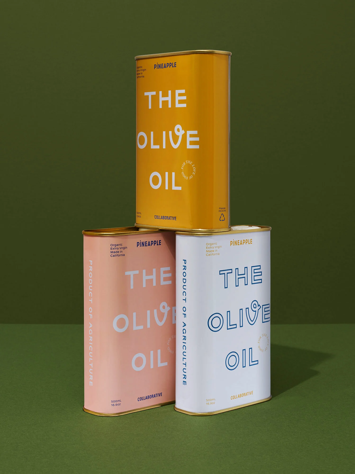
Pineapple Collaborative is on a mission to connect & celebrate women who love food! They believe that sharing knowledge, supporting each other and coming together for a meal — is the best way to create community. This sentiment lies at the heart of Pineapple Collaboratives business and their new line of pantry staples featuring women made olive oil & apple cider vinegar.
This project started with a deep-dive into Pineapple’s primarily online brand. They fostered a following by building a society around small, local dinners. It’s since grown into bi-monthly panels & events around the country. We wanted to create products that ultimately spoke to their audience, while also engaging others interested in their philosophy.
For this project, we knew the vessels would play a critical role. We explored several silhouette pairs that were both sustainable & recyclable. For the olive oil we wanted to tap into the nostalgic feeling associated with the classic olive oil tin — so we worked with a traditional tin maker. For the ACV we sourced a beautiful apothecary glass bottle with a natural feeling wood/cork top, whose proportions would inherently compliment the tin.
We established a visual link across both products. The role of product naming, messaging and how these were expressed through typography meant we could establish a family look & feel. We introduced new & distinctive typefaces to help achieve this goal. By creating messaging elements such as ‘FOR THE LOVE OF FOOD’ and ‘MADE BY WOMEN’, Pineapple Collaborative could further utilize these online and for their newsletters, events as iconic brand elements.
The Olive Oil is produced in 3 contemporary colors so you can choose which one best compliments your kitchen. When positioned alongside the ACV... the result is a vibrant product family. This ultimately extends from a brand philosophy that says 'what we cook and eat reflects our unique styles, identities, and values'.
Bon appétit.
Good things take time, this is especially true when it comes to beer. Westbound & Down Brewing Co. pride themselves in making sophisticated, challenging & delicious craft-beer. They wanted a dynamic label system that easily identifies new additions to an evolving (and limited) collection of bespoke beer releases.
The brewers at Westbound & Down wanted to break out of craft-beer conventions with beer & packaging that redefines the category and elevates their product at levels generally associated with high-end wine.
We created a dynamic series of oversized & bespoke numerals, applied to a rigid grid for information, making each beer feel unique while simultaneously forming a visually compelling collection.
Playful use of typography underpins this concept. The energy, creativity & passion that goes into the brewing process is echoed through the creative direction of these labels. The intention behind the typography mimics the nuance of the beer.
The brewery offers a 'Bottle Club' subscription service to a select group of beer aficionados. Every 1-2 months they release new editions to an evolving collection of uniquely brewed beer intended to captivate, challenge & inspire their savvy audience.
We created a canvas for typographic expression by establishing a minimal yet rigid label grid - designed to present all of the mandatory label information. In contrast, oversized bespoke (one-off) numerals freely overlap the support structure to reinforce the flair associated with crafting beer at this level.
The decision to present the beer in oversized bottles more akin to wine provides a visual link to the overlap of these two worlds. Wine processes have been adopted throughout the collection, imbuing flavor & funk to an otherwise craft-beer centric space.
We wanted a label that felt more like the toothy pages of a beautiful book, versus those of a glossy mag. Tactility is not often associated with beer packaging, where labels tend to be smooth or synthetic (to survive in the chiller). Tactile fridge-safe stocks have allowed us to challenge the status quo.
Since its launch in early 2018, the collection includes 5 editions with more due for release soon — we're excited to see how the series unfolds.
We rebranded quintessential L.A bike brand LINUS. With their roots firmly planted in Venice life & culture, it felt like the perfect fit. The project resulted in a refined recut of their logotype and it’s application to their bikes, apparel & accessories.
Introducing a new brand identity and packaging for therapeutic perfumer Bodha. Bodha is creating a new world of therapeutic perfumery for you & your home. We’ve elevated their expanding collection with a vibrant, yet timeless visual identity and sustainable packaging that delivers a beautiful sensory experience.
Bodha’s mantra ‘Come back to yourself’ is brought to life through an illustrative detail that acts as a gentle visual reminder every time you open the box. Sensory details such as the blind bevel-edged emboss & tactile paper stocks bring you into the moment.
In addition to their infamous smokeless ritual incense, Bodha’s collection includes aromatherapy eye-pillows, diffusers & diffuser oils and their soon to be released... Vibration collection of 3 natural therapeutic perfume oils. Visit bodha.com for more.
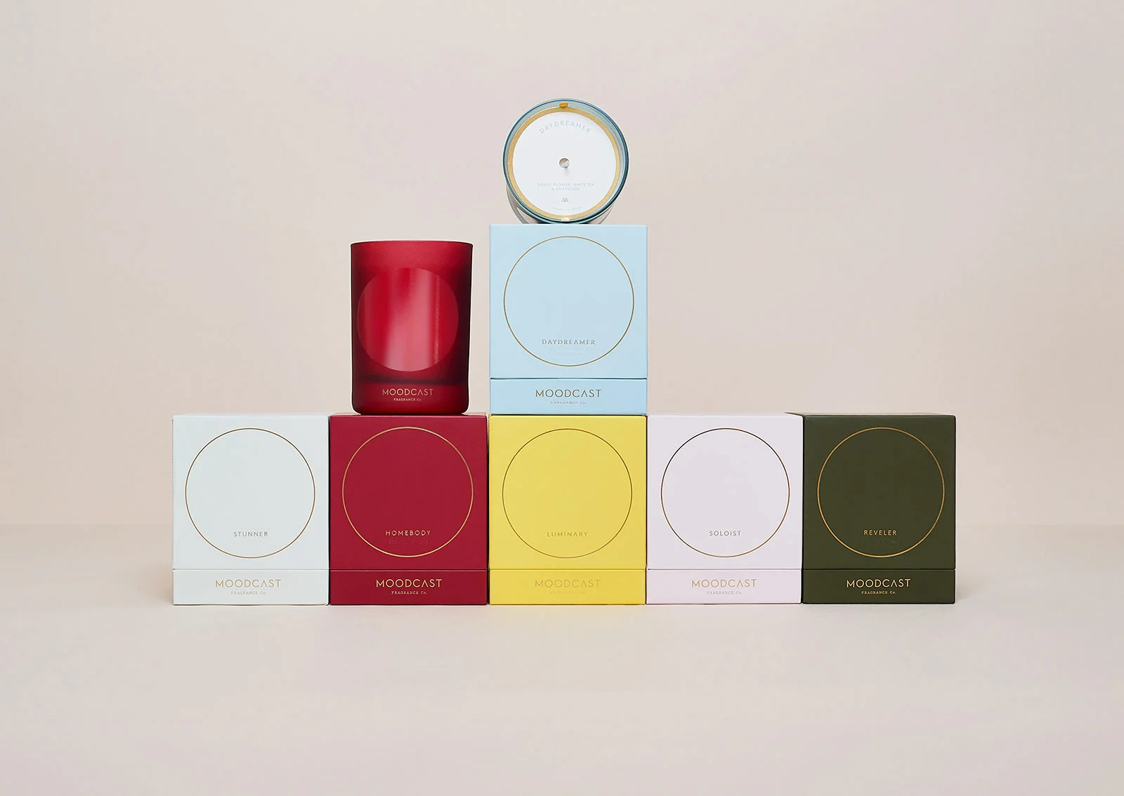
Moodcast Fragrance Co. is a new perfume brand dedicated to helping people evoke mood through scent. For their first collection, a family of six candles, we created a brand identity, custom glassware & packaging.
For the glassware we designed individually coloured matte-glass vessels with a translucent circular window to reinforce the concept of personal space & highlight the flame as it burns.
Colours are inspired by 60s Finnish glassware & the principles of colour-therapy to create a palette that reinforces each mood. A single gold foil highlight on glassware & packaging creates pop & establishes a luxury aesthetic.
Friends (and fellow kiwis living in L.A.) Luke Harwood & Gabrielle Mirkin wanted their Manuka honey brand to celebrate a powerful period in New Zealand's history. A time when locals stood up and exercised their rights and left-over house paint was re-purposed for protest signs. The design direction echoes this sentiment through a vibrant colour palette, emphatic typography & tactile stock. The customised Edwardian Activist logotype taps into history but through the pairing of a modern geometric sans, it feels contemporary. The gold foil accents honour this beautiful product and make it feel special. Protecting what you love & standing up for what you believe in underpins the Activist brand and is particularly relevant today.
Luke & Gabby are proudly championing the real-life relationships that make Activist so unique. Working with a dedicated team of honey fanatics to bring the finest raw Mānuka honey to the US, they're also working with close friend and photographer Derek Henderson to tell their New Zealand origin story. We're excited to be part of the family bringing this wonderful product to the USA.
Please support this great product by visiting ActivistMānuka.com
A bold new identity for this Los Angeles newcomer. Ben Duvall's hypermodern typeface Melrose supports South Society's series of graphic marks.
South Society's studio roots tie back to New Zealand & Australia. They aim to provide US businesses with strong creative thinking via their network of highly skilled Antipodean collaborators and craftspeople.
Winc Wines is making a dent in the wine world, demystifying the category & making wine accessible to younger clientele interested in a good drop. P:Y:T was a brand Winc established in 2015 but was in desperate need of a refresh. I helped them establish a cohesive system that would allow them to easily introduce new varietals and processes. Launching with a Nouveau and a Pet-Nat, I'm excited to see what's next!
The National Institute of Dramatic Art needed a world-class identity to ensure the organisation, and Australia, continue to punch above its weight on the international stage.
NIDA is responsible for some of the biggest names in Australian creativity. The rise of YouTube and similar channels has seen the democratisation of performance – anyone can do it.
A contemporary new identity befits NIDA’s status as a global cultural powerhouse, while the brand architecture is designed to broaden NIDA’s appeal beyond the dramatic arts in response to growing demand for performance skills across a wide range of industries.
Working closely with MAUD, we created a dynamic and tactile new brand for Australia's premier institute for dramatic arts. The family of logos allowed for diversity within a contemporary and consistent look applied across business collateral, engaging course guides & building signage.
I partnered with Inhouse design and creative agency Shine who worked closely with the team at Lion Australia to create Höpt. I was part of the core team and played a key role in the design of Höpt, a low sugar non-alcoholic soda.
The sodas are packaged in 330ml bottles and feature coloured twist crown seals and labels with number for easier ordering in a noisy bar.
Awards:
Hopt - Platinum, A' Design Awards
Hopt - Bronze in Packaging, The Best Awards
Dada Wines was established with the sole aim of creating unique, non-classifiable and exceptional wines.
Dada is a personal, artisanal project of french wine consultant David Ramonteu and New Zealand winemaker Kate Galloway; a project that defies industry conventions both in winemaking and design.
Sitting alongside a heavy-handed gold foil logotype, a wooden hand mannequin is used to graphically represent the numerical symbol of the Dada Wines — a signifier of the handmade nature of the wine itself.
Designed in partnership with Inhouse Design.
Awards:
Exhibited in the San Francisco MOMA
Silver, The Best Awards (Dada I)
Silver, The Best Awards (Dada II).
Working closely with Inhouse we created an identity system for the rejuvenated Seafarers Building in Auckland’s Britomart precinct.
The building’s rich history as home to Auckland’s Sailors provided the basis of the nautical themed branding which is applied through bold pattern and a limited navigational colour palette to many of the touch-points throughout the building — everything from elevator doors to House Rum.
Awards
Best Identity, Eat Drink Dine Awards
Gold, The Best Awards
Silver, The Best Awards